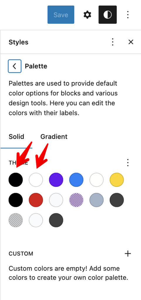
The main part where you need to change your global styles is Style editor. The theme has many predefined colors and you can hover over each color to see where it’s used. Also, theme has some predefined style variants. It’s important to mention that there are two critical colors – Base and Contrast color which are responsible for the content background and content text. If you change these colors, then, the background under your content will be also changed so we don’t recommend changing it too much. Anyway, both colors must be opposite to make them contrast.
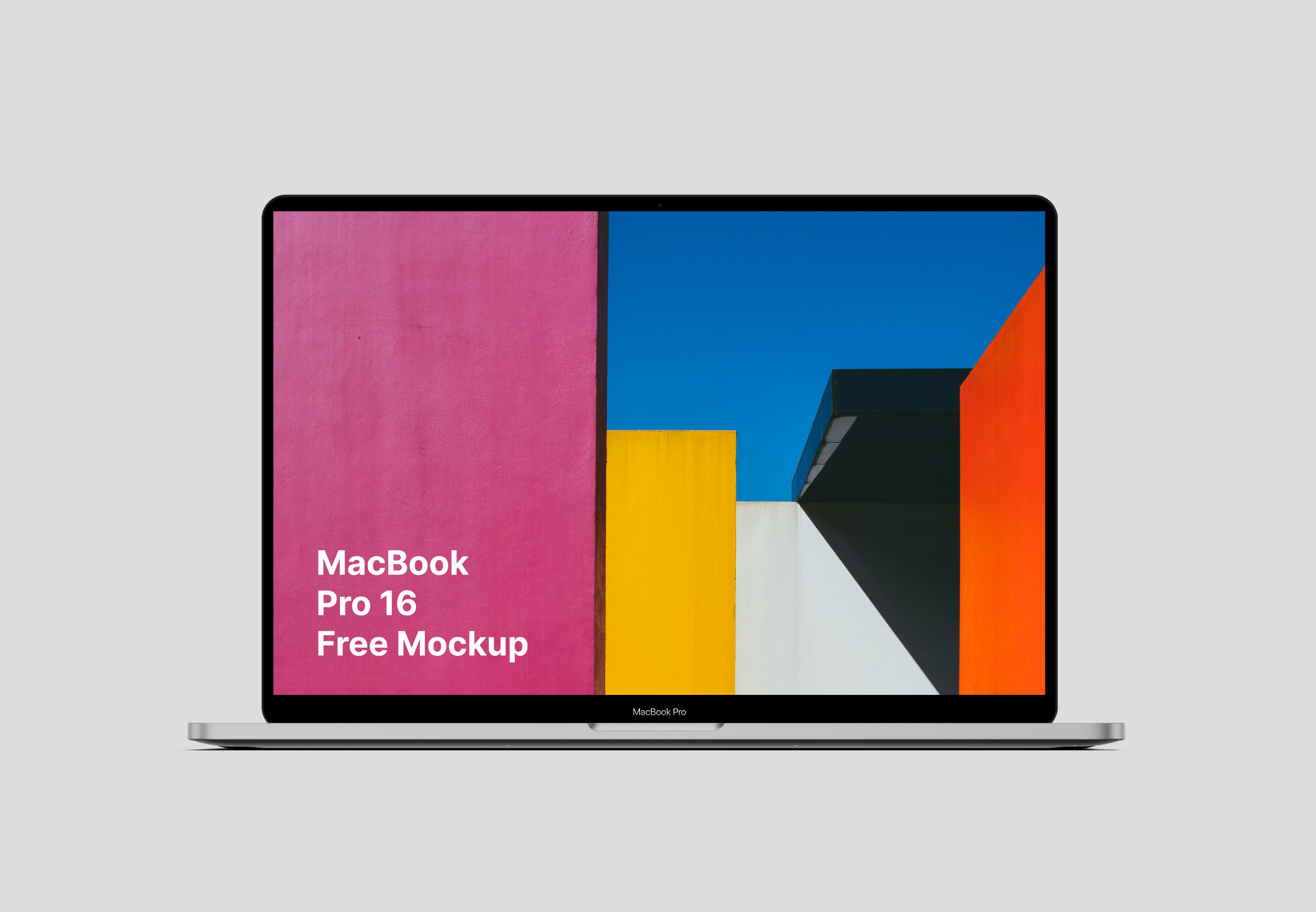
If you want to change colors in Templates, edit the template in Site Editor and replace colors in Main parent Group
Base and Contrast colors are used also in Night mode (they switch each other), so if you want to make a block that has always dark background or white text, set the Custom color as #000000 or #ffffff. In this scenarios, they will not depend on your base and contrast global colors
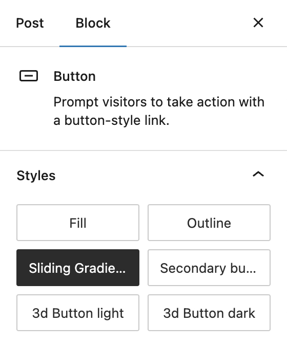
Styles for Blocks
Greenshift theme has a lot of ready style presets for each core blocks.
For example, here are button variants
Or example of Heading block style
Heading Gradient mask style
It’s easy to find such styles for each block, they are placed in the style selector
Additional classes
But there are also some additional styles that you can get if you add special classes inside the Class panel
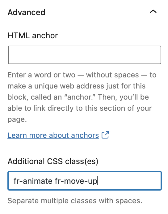
You can mix these classes with styles.
Navigation link block
gs-soft-roundedgs-hard-roundedPost featured Image block
Class to make some hover scale effect
gs-hover-scale-imgButtons block
gs-tablet-centerUse this if you want to make button as center align on tablets and mobiles
gs-tablet-startUse if you want to replace right align to left align on tablets and down
Column block
gs-tablet-collapseWill make collapsible columns not only on mobiles but also on tablets
Leave a Reply